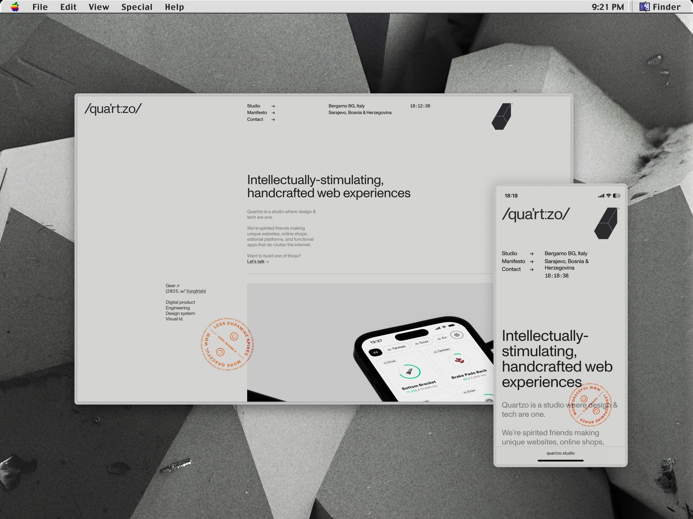
/qua’rt:zo/ is our belief in a calmer, more graceful web. In this studio that I founded alongside Mateus Dal Bianco, we design and develop websites and webapps that breathe slower.
An interface is a membrane between humans and machines. Creating systems that regulate their symbiosis is a physiological matter.
I
Question
Our challenge was to communicate these values in a timeless manner, without resorting to nostalgia or absolute answers. Our admiration for the simplicity of the early web needed to be at the core. Yet, we wanted a hint at the tactile, the real.
How can we make websites that are calmer and lower on dopamine spikes, and yet feel fresh, pique the curiosity?
II
Answer
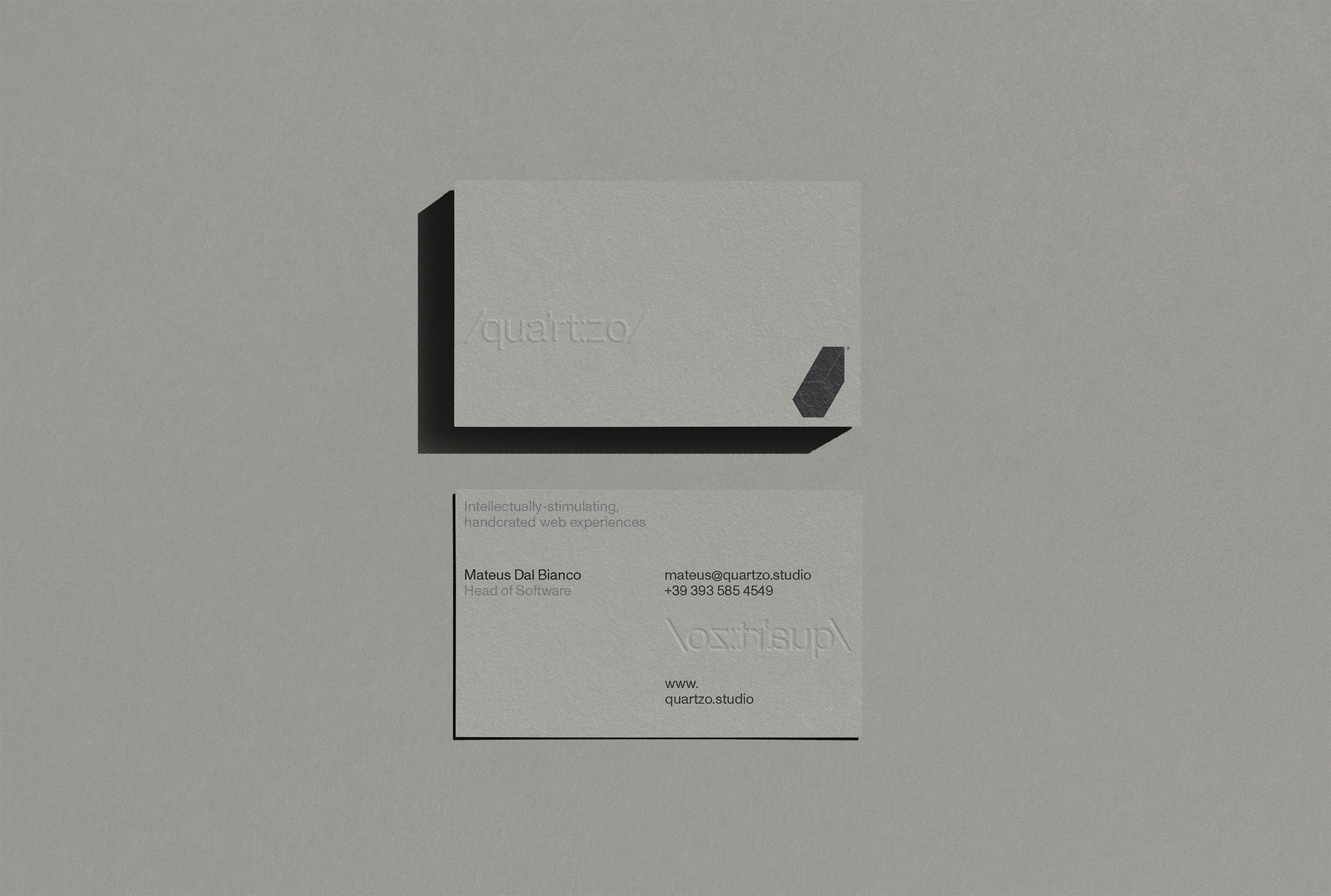
Touch some paper. We saw in print media the promise of a web experience that feels grounded, integral. The book was a response to the scroll(ing). It added margins, pages, indexes, empty space. It was designed and refined over the centuries for focus.
✹ By applying those same principles, we enabled people to stay on our catalog-like website for an average of 1m 46s —more than 3x the average for tech websites. No overstimulation, no attention traps.
Our ethos: these visual references cue people to a state of calm and focused attention. When we get a book or catalog to go through it, we go into this state of deeper information absorption.
Printed media got to that over centuries of experimentation. We can lean onto that for the web too. Screens can learn from paper.